
Words on a page
The semantics of layout — regular features
The Semantics of Layout
As I write this, we’re two months out from the release of Mitzvot and Selected Letters, which means that it’s time to get in all that last-minute typesetting cleanup while there’s still a chance. All the words are there, everything’s been edited, and hey, all of the layout’s just about done, but there’s always little things here and there that can be improved.
I give the occasional talk on book layout and design, and there are two things that come to people’s minds when I talk about typesetting: kerning (the spacing between letters) and widows/orphans (last lines of paragraphs at the top of the page/first lines at the bottom). In both cases, I think these come to mind because of the very nature of being things that cause friction while reading that goes unnamed until someone points them out to you, and then you see them everywhere.
In these talks, I usually tell people to just not worry about kerning. If it’s a big problem, I’m sure you’ll know, but if your job is typesetting a book, the chance that you’ll be dealing with kerning are astoundingly low, so long as you’re using a modern TrueType/OpenType font. It’s still very important, but realistically, any real problems you might think of have already been addressed by the font designer. Graphic designers are more likely to worry about this sort of thing than typesetters.
As for widows and orphans, I tend to caution that the actual issue is more complex than simply “don’t”. First, sometimes, you’re just not going to be able to avoid them. There won’t be a valid compromise that won’t lead to some greater typographical sin, such as unbalancing recto/verso pages or whatever.
Second, the issue isn’t simply that there is one line of text at the top/bottom of a page, but that turning the page or the saccade (the quick movement of the eyes from one location to another, as opposed to a smooth movement) from the bottom of the verso to the top of the recto is a few milliseconds during which the reader technically stops reading. The internal representation of the text that they’re following on the page pauses in their head while the process completes before picking back up. This is echoed pretty succinctly in saccades themselves: When your eyes jerk from one point to another, your visual cortex actually steps down processing the input to prevent the perception of motion blurring. Similar to this saccadic masking, the reader’s thoughts will linger briefly on that last word on one page before they pick up on the word on the top of the next page.
The typesetter’s job becomes one of managing these breaks in such a way as to reduce friction for the readers. You’re never going to be able to solve them entirely, but you can at least mitigate the effects.

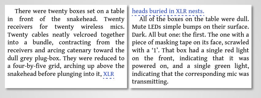
For instance (and you’ll have to forgive the lack of justification in the last line of the first page), having exponentially be a widow will leave the reader staggering somewhat, as they linger on the verb building only to be left with a single, flimsy adjective. If If the microphone started to pick up were to be an orphan on the verso so that it didn’t require a page turn, it would probably be fine, but having to take that extra time to turn the page of the book, while still holding the infinitive to pick up in one’s head adds just that much more stress on the reader, so if it can be avoided, it should. Finally, breaking a page on punctuation introduces a tiny bit of friction for the reader: a comma and a full-stop look similar enough that one has to hold not just the stream of text in mind, but also whether or not that last dot had a tail. This, of course, only really comes into play when the text before the comma is an independent clause. Better to ensure that one doesn’t break between independent and dependent clauses:
All this to say: shit’s hard, yo.
Or, well, not that hard. I already addressed the two steps that are required to tackle this, even. First, just being aware of what these issues are gives you the ability to read through a text that you’re working on and making note of them. Second, being willing to give up on a truly friction-less read — an impossibility if ever there was one — and settle for a comfortable read. The goal of the typesetter is to reduce barriers between reader and text, and the best way to do so is to consider the semantics of what’s happening.
Typesetting Mitzvot has been the first time that I’ve really had to worry about this when skipping an entire page’s worth of text because there’s a whole-ass illustration there.

So, here we have an orphan at the top of page 18 that’s not just a whole page-turn away, but comes after the visual distraction of a graphical element. Here’s the reasoning behind the layout that I settled on:
The illustration appearing on the recto lets the reader look at it before dealing with the page turn.
That it comes so soon after a section break means that the reader can finish the first section, look at the illustration, then continue on from there.
Finally, of course, we don’t end on any punctuation that requires holding additional context in one’s head while both glancing over an illustration and turning a page.
There’s meaning behind everything we do with books. There’s meaning in the words, yes, but there’s also meaning in font choices–

–image placements, color choices
–and, yes, even where the words are positioned on the page.1
Regular Features
Word of the week
Cairn — n
A pile of stones used as a landmark or monument.
Beat Saber map of the week
Frum —Wavetapper, mapped by Mawntee, recently updated!
Whether Camera2 follows my avatar or the environment seems to have more to do with the weather than anything else.
Dog of the week

There's something meditative about fussing with LaTeX making minor improvements. My papers and dissertation had some heinously long equations, but with enough pattern that the LaTeX looked pretty all on its own. Though I was annoyed the one time my professor replaced most of the commands with two-letter macros.
Oh, here's a question for a LaTeX expert (you). Does liking \! make me a bad person?
Reminds me a lot of the book arts class I took in college. Only difference is that all the typesetting had to be done manually with metal type. How it looked on page was all done with precisely arranging the metal type between wooden blocks and spacers. Definitely made me appreciate it as an art more than just a job.
Thank goodness for digital though! I never really thought about how widows, orphans, and even illustrations could affect the way I read. The examples you chose were perfect for exploring this often-overlooked part of publishing.